Mamaleh’s
Modern deli — Classic soul
OverView
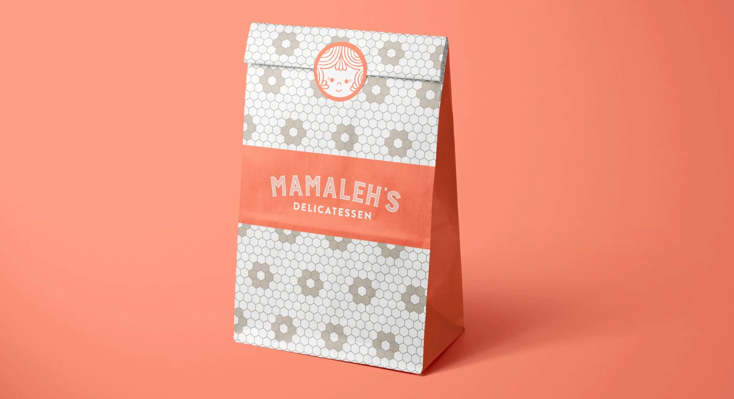
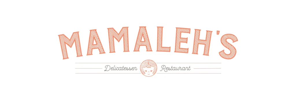
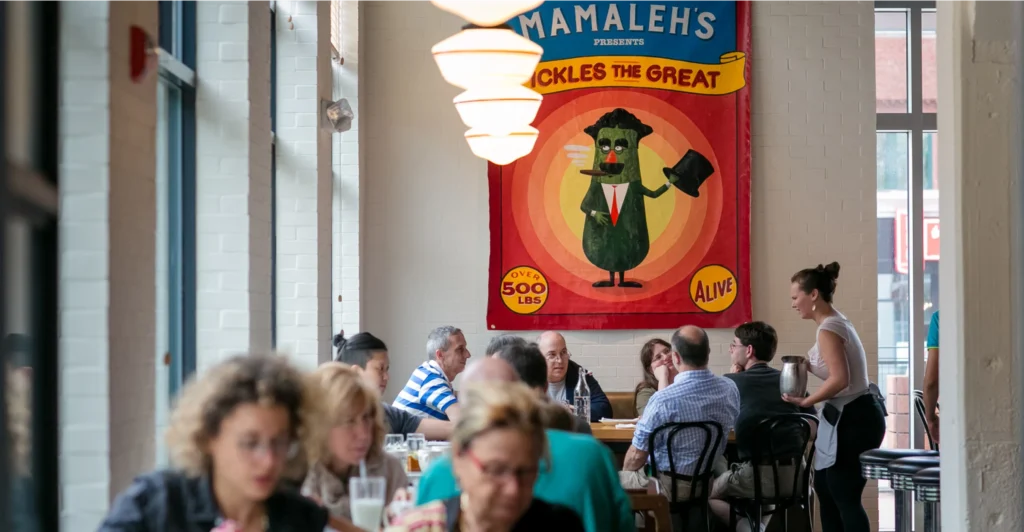
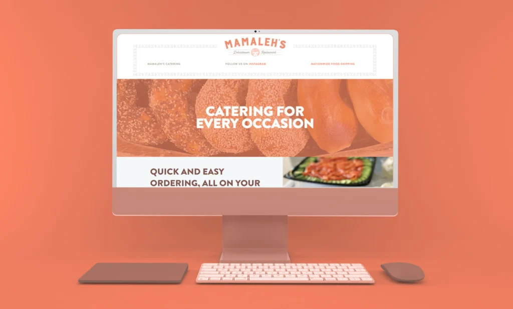
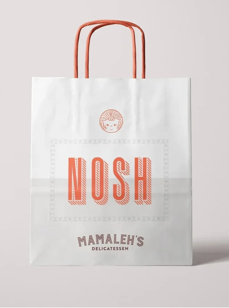
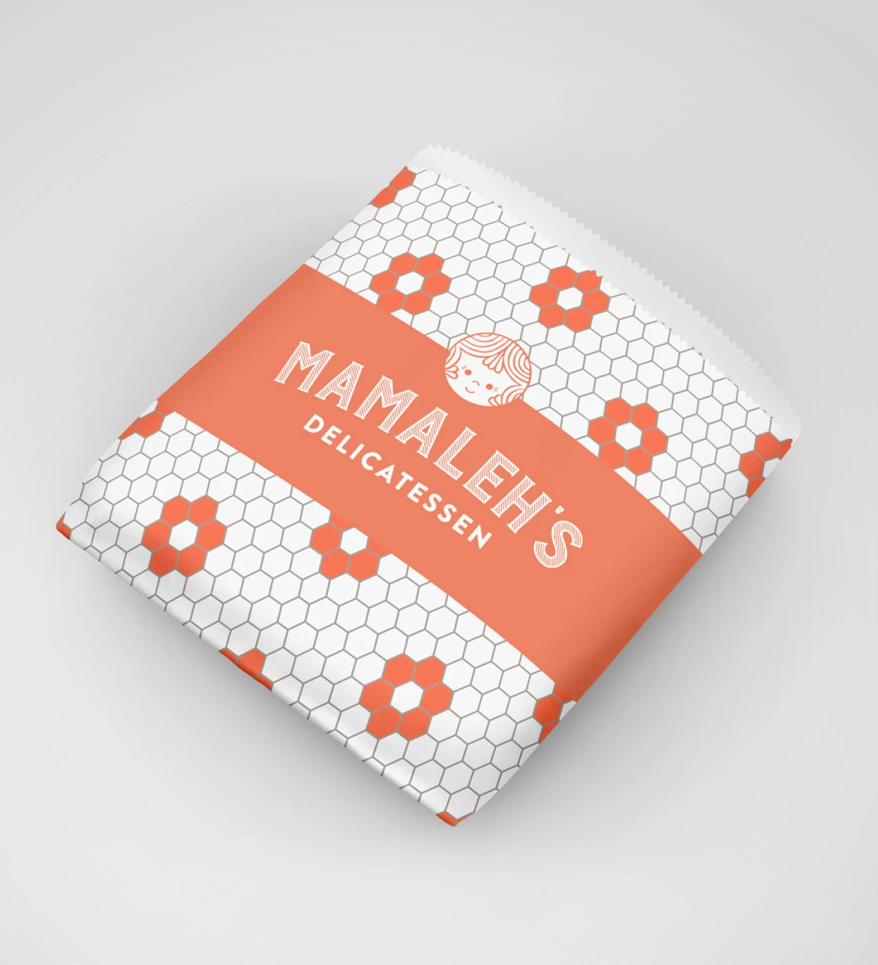
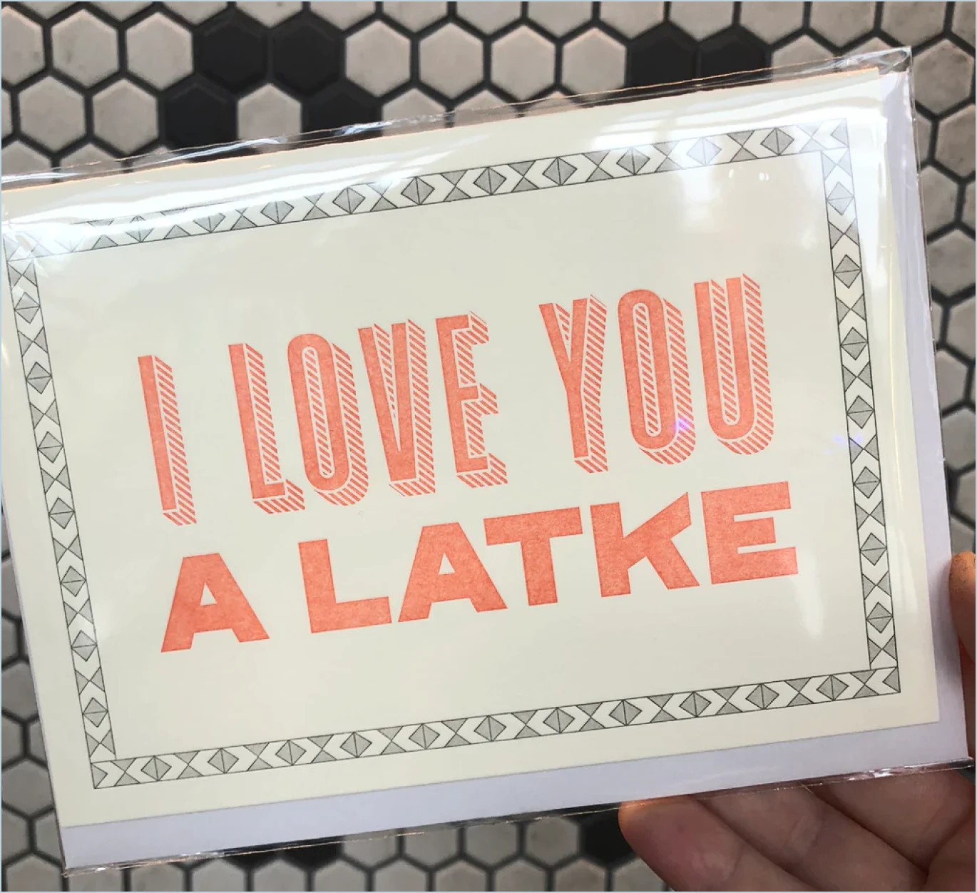
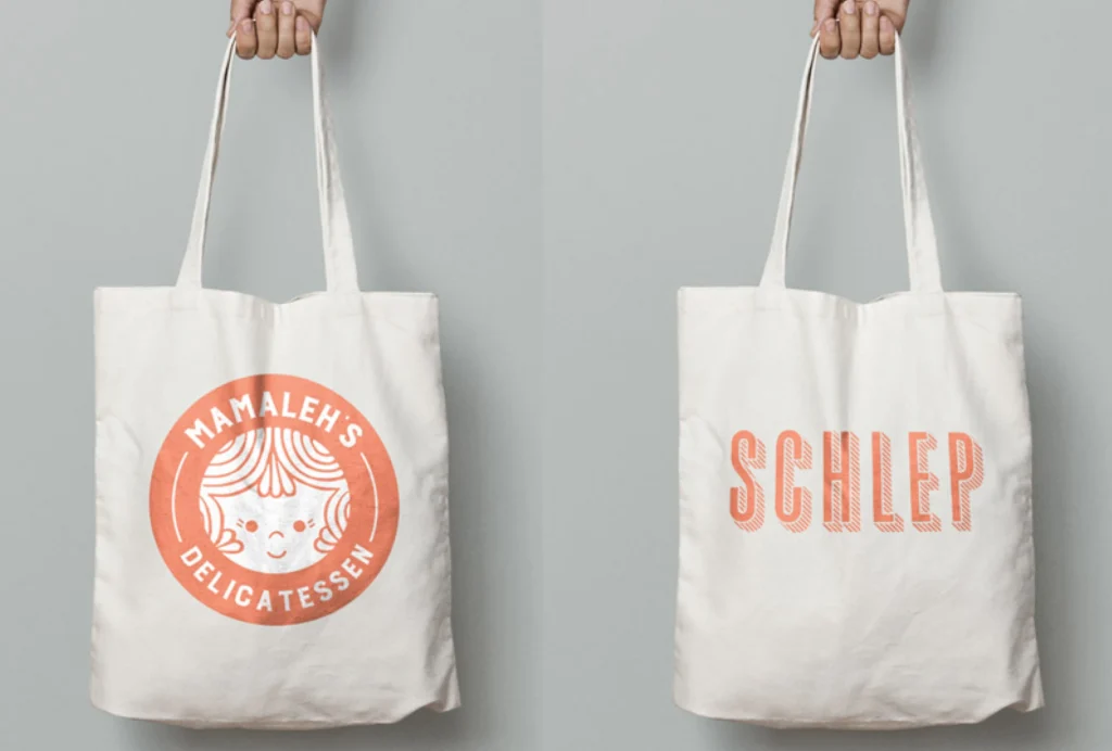
Before they were a local staple with multiple locations, the Mamaleh’s team partnered with ICS to create their brand design and website. They wanted a brand that leaned on nostalgia to dovetail with a decidedly old-school interior and their cheeky, playful personality. We began by taking inspiration from the name of the restaurant itself. “Mamaleh” is a Yiddish term of affection roughly meaning “little mama” — and also a subtle nod to the owner’s former restaurant, Hungry Mother. We developed a logomark that’s sweet and joyful with typography rooted in traditional Jewish delicatessen signage. The palette is based on a rich but inviting orange complemented by cooler neutrals as well as an accent of green as an homage to the deli staple, the half-sour pickle.
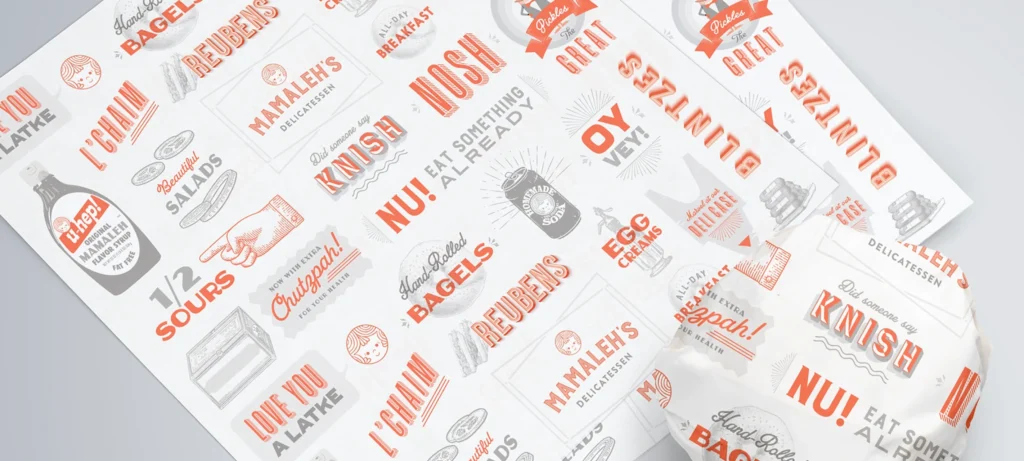
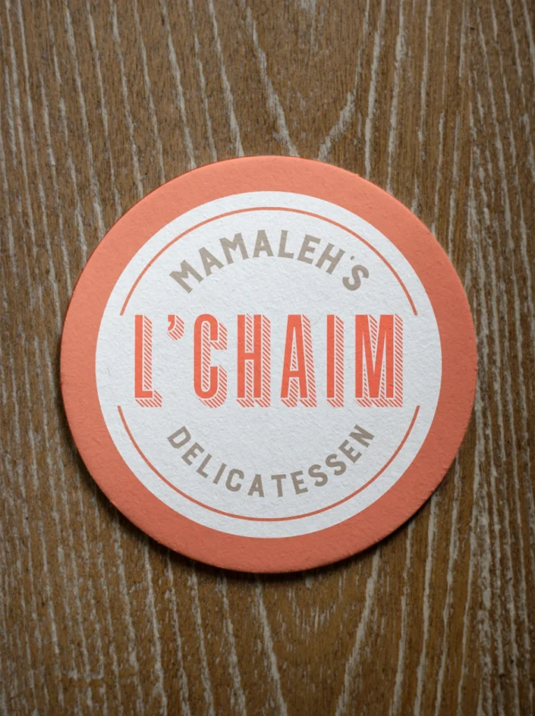
This unique palette flowed into a number of other deli-inspired collateral pieces such as custom wax paper and menus and into the merch we custom designed for their small grocery item and gift shop they tucked in a small area near the entrance.
Our Role
- Logo
- Brand Identity
- Merch & Collateral
- Content Strategy
- UI/UX Design
- WordPress
- Creative Partner
Industry
- Restaurant


Get In Touch
We are full of ideas, we just need someone to share them with.


