Go Therapeutics
A clean start for an industry leader
Overview
After 20 years of groundbreaking scientific work, GO needed their brand and digital presence to match their ambition. They partnered with us to create a bold new identity that would attract pharmaceutical partnerships and position them as leaders in next-generation cancer therapeutics.
GO Therapeutics is revolutionizing cancer treatment with their “super clean” targeting technology. Their innovative approach identifies and targets sites found only on cancer cells—not healthy ones—making treatments dramatically safer and more effective than traditional therapies.
Our Role
- Brand strategy
- Brand identity
- UX/UI Design
- WordPress development
- Collateral
- Brand Guidelines
Industry
- Biotech & Life Science
Our mission
- Create an intriguing, bold brand identity
- Design a sophisticated website showcasing their revolutionary platform
- Position GO as the definitive leader in clean target therapeutics
- Drive partnership inquiries from major pharmaceutical companies
From day one, the GO team was poised to make changes and work collaboratively with ICS. Their small, decisive team—led by two key stakeholders—trusted our expertise and shared our appetite for creative innovation. As their CEO put it, they wanted to be “the Radiohead of biotech”—different, bold, and ahead of the curve.

The creative solution
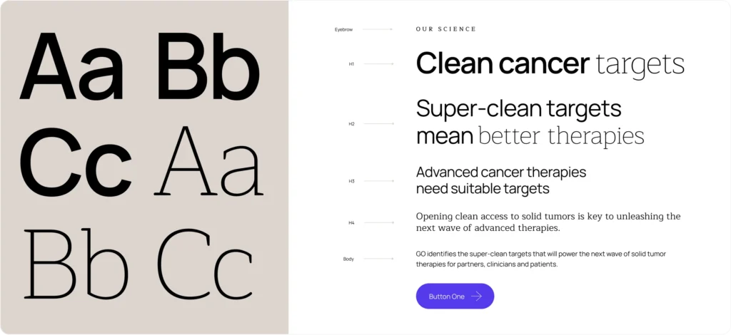
We developed a striking visual identity that marries scientific precision with creative vision:
- Clean, minimalist design reflecting their precise targeting approach
- Custom scientific illustrations that simplify complex concepts
- Sophisticated design system adaptable across all touchpoints
- Engaging narrative format that appeals to both scientific and business audiences

Visual language
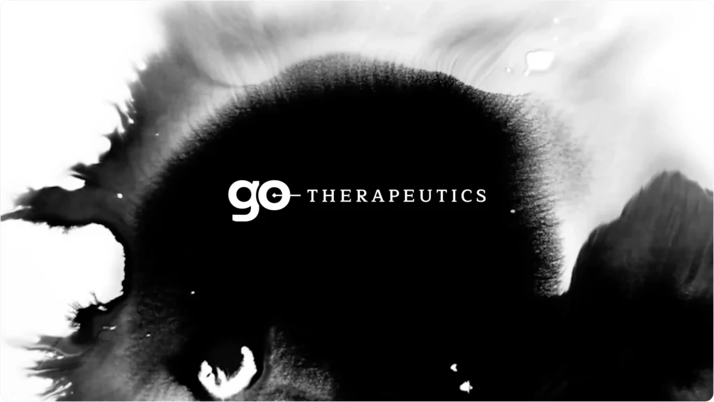
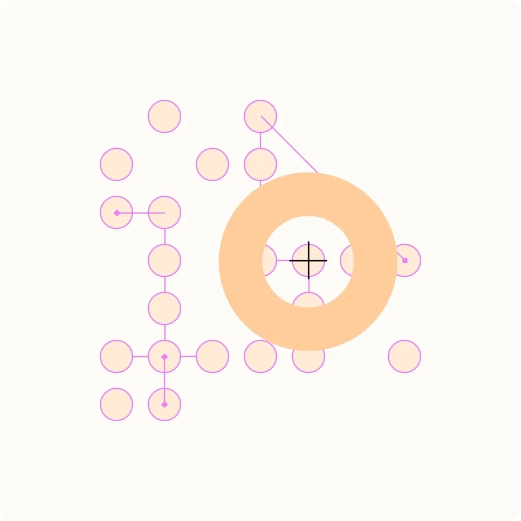
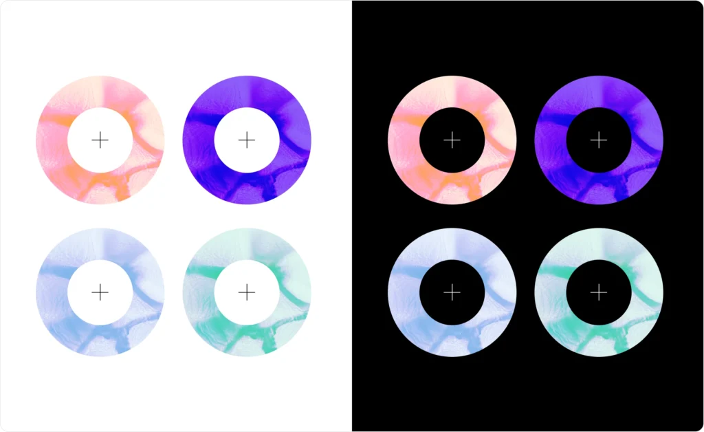
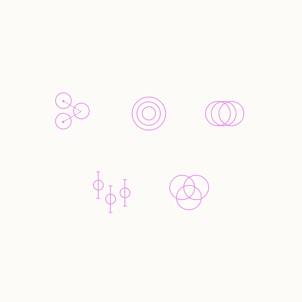
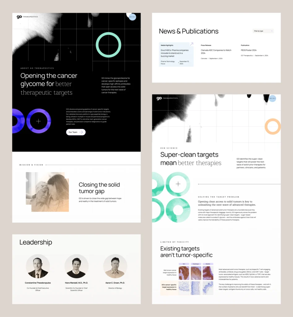
GO Therapeutics visual language aims to capture their precise and novel scientific approach. The primary brand elements feature target circles and ambient videos of ink blots. The simple geometric shape of the target circle captures the essence of “super clean targeting,” and the accompanying cross and grid emphasize precision. The reverse ink blot videos are a visual metaphor to communicate the “removal” or “reduction” of cancer cells through GO’s selective target therapies.
Logo
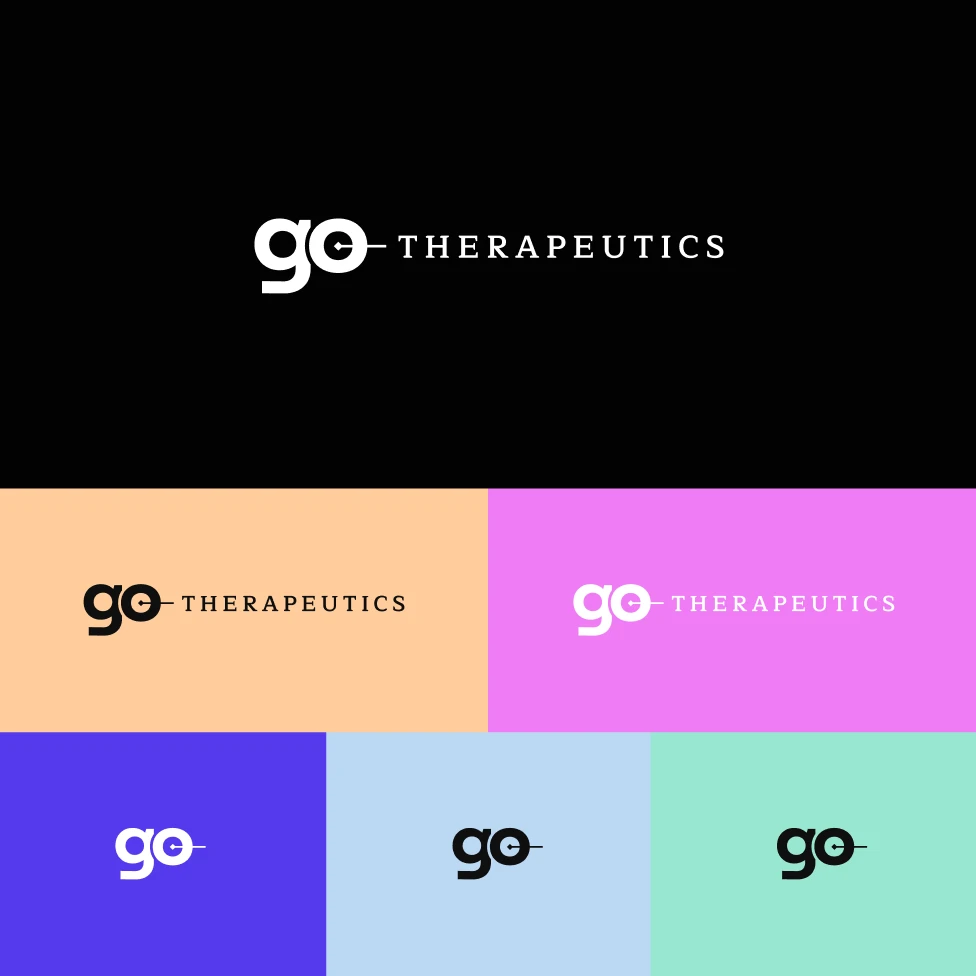
The redesigned logo for GO Therapeutics is a refined and sophisticated representation of the brand’s core mission and science story—precision in targeting cancer cells while preserving healthy tissue.
The most striking feature is the circular element within the “o.” Bisected by a line, this circle represents a crosshair or target, symbolizing GO’s commitment to precision medicine. The crosshair denotes the pinpoint accuracy with which GO Therapeutics’ treatments are designed to identify and attack cancer cells, emphasizing the focus on targeted therapies that aim to minimize collateral damage to healthy cells.


Technical excellence
Developed on WordPress, the site is built with a responsive design that ensures optimal performance across all devices. The WordPress Gutenberg editor provides a robust and user-friendly modular content management system that allows the GO team to easily update content and add new resources as their needs evolve. Robust analytics integration through Google Analytics and HotJar provides valuable insights into engagement, usage, and even possible issues, helping to measure and optimize site performance. Additionally, rigorous quality assurance testing across all major browsers guarantees a polished and professional experience for both users and administrators.
Looking forward
With their new digital presence, GO Therapeutics is perfectly positioned to advance their mission of transforming cancer treatment through pharmaceutical partnerships. Their bold new identity reflects both their scientific rigor and visionary approach, setting the stage for the next wave of cancer therapeutics and for the next milestones of the company.
Get In Touch
We are full of ideas, we just need someone to share them with.
